Design for People

Written by Aaron Shannon-Honson
When designing courses, equipment or anything where humans are the end user, the idea of designing specially for the human can get lost in the project or design. When designing courses and activities for students, it is important to continuously remind ourselves the end users are the students, how will they perceive our output?
Our Learning Resource Developer, Aaron Shannon-Honson wrote a piece on human centric design, why it works, and how to go about it.
ItŌĆÖs common that we use shorthand to describe the people that engage with what we make. ŌĆśusersŌĆÖ, ŌĆśstudentsŌĆÖ, ŌĆślearnersŌĆÖ ŌĆō these phrases arenŌĆÖt wrong or even inaccurate, they just tend to obfuscate who weŌĆÖre really designing for: People.
As we explored in Andrew BeattonŌĆÖs╠², it can be difficult to design for others as you might find yourself excluding them because you are designing from your own perspective. Stripping a person down to their action ŌĆō using, learning, etc. ŌĆō accomplishes the same thing. People are complex, irrational, and emotional. We design for people as they come; designing for their actions removes them from their context and circumstances.
Dissecting a creative work is like dissecting a frog. NobodyŌĆÖs╠²│┘│¾▓╣│┘╠²interested and the frog dies. So here, IŌĆÖll sacrifice some of our interactives and show some key concepts of designing for people. If we make experiences inclusive,╠²╠²and people-focused, weŌĆÖre designing for everyone and everyone feels welcome and are engaged.
You can follow along by╠²╠²and seeing these examples in action for yourself.
Use Conceptual Metaphors
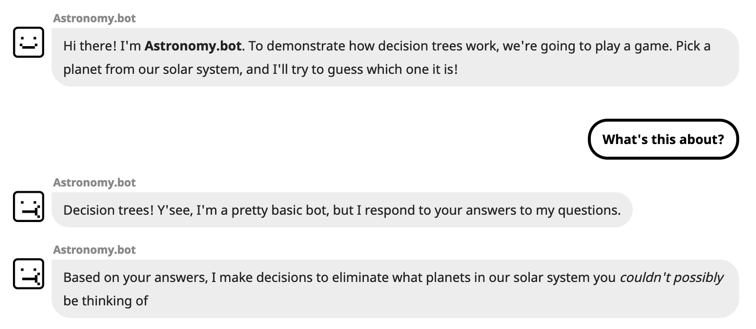
The interactive bot demonstrates how decision trees work in the context of data structures and takes people through the process of moving from node to node. We tend to understand a new idea or concept by linking it to another. Choices in this chatbot-like environment represent each decision point in a decision tree. This link is further reinforced at the end of each branch:

We lean into the conversational metaphor too by tailoring the content for a chat delivery method. This means using conversational-style language and adding in small quirks such as chunking the content up into several messages, simulating a real conversation:

Each ŌĆśfaceŌĆÖ of the bot changes based on the message too, to add extra personality and connection to the audience
We also add a delay to the next message appearing depending on how long that message is to simulate the bot ŌĆśtypingŌĆÖ back to you:
![]()
This ties into our next decision.
Add Delight
We remember and respond favorably to new, unexpected and playful pleasures. Small details of surprise can add delight to an experience. Small animations and content tweaks to create a fun personality of the chatbot ŌĆō where we even gave them the name of╠²Astronomy.bot.
Decision trees and chatbots can be quite closed to outside-the-box thinking. Our bot had a fun personality so we thought: ŌĆ£What if you tried to trick them?ŌĆØ
![]()
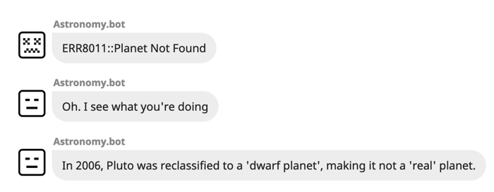
If you try to trick the bot into guessing your planet is Pluto, or you answer a series of questions that lead to an impossible planet, youŌĆÖll be treated to an exchange like this:

Featuring bonus ŌĆśannoyed bot faceŌĆÖ
╠²
The fact that you tried to trick them is also remembered in the next loop of the activity. These types of unexpected experiences are ŌĆśeaster eggsŌĆÖ and allow for an extra layer of personality in your interactive by adding a fun surprise for people to find. This is common in our work: for our Shakespeare Matters ŌĆśŌĆÖ quiz, it was rarely possible to be assigned the bear from the famous WinterŌĆÖs Tale stage exit:╠²exit, pursued by a bear.

ItŌĆÖs niche, but itŌĆÖs an extra delight
Allow your audience to have fun with what you create, and theyŌĆÖll remember more, engage more and get more value out of the activity. Be delightful.
Power to the People
Finally, we also want to remember that we arenŌĆÖt the target audience. Our interactives are not designed in a vacuum and we promote genuine partnership with students to create them, both from a studentŌĆÖs point of view and as a person. Our Shakespeare interactive in particular was developed mostly by a student and assessed by other students in a development-review cycle. We evaluate, among other things, both whether the interactives are useful for them as students,╠²and╠²if they have enjoyed the experience.
WhatŌĆÖs wonderful about people are our emotional, irrational sides and this isnŌĆÖt universally understood across cultures so we also want to keep reviewing and testing while continuing to try new things to create meaningful connections.
How can you use these ideas in your work?╠²Think like a person going through it. What would you enjoy seeing if you were interacting with it? Add hidden surprises and fun for people to discover. TheyŌĆÖll enjoy the experience and get more out of it than if it were dry and by-the-numbers.
Make things enjoyable, human, and genuine. Design for people.
To find out more about Learning Resource Development, take a look at our╠²Resource Development webpage, or get in touch with the╠²Media Production team.
Aaron is one of our Learning Resource Developers who has worked on the Shakespeare Matters MOOC and the Micromasters Project. Aaron is now currently working in Online Programs for UoAŌĆÖs online offerings.

